Web Store Analysis - Screencastify

One component of the Chrome Extension growth stage I talk about often is the Web Store and how important it is to optimize it for growth. Although you can grow an extension without paying any attention to the Web Store and how optimized your page is, you would be giving up on a potentially significant source of traffic.
In light of this, I wanted to start a new series of blog posts called Web Store Analysis where I take a look at a number of Chrome Extensions in the web store and break down everything, good and bad, about how they're set up and presented. For the first analysis of the series, I chose Screencastify, which is an extension that allows you to capture, edit, and share videos quickly in the browser.
Summary Section
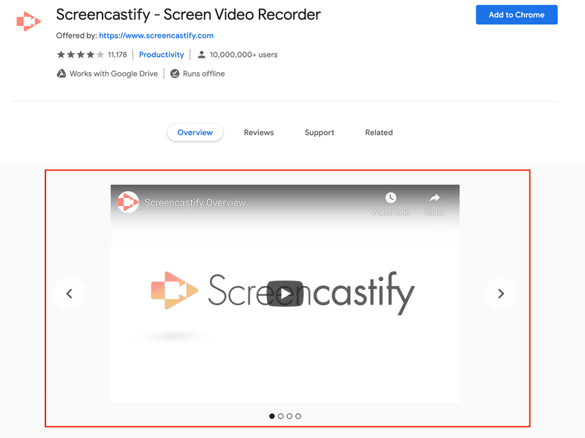
The first section I'll take a look at is the Summary Section which contains all the high-level info about the extension and typically appears in search results. For this section, I'll take a look at the title, small promotional image, and description.
Title
The title is great and there isn't much to address here. It uses a tip I've talked about in depth, which is using your extension to also briefly explain your product (i.e. Screen Video Recorder).
Description
The first sentence of the description, The #1 screen recorder for Chrome, could be removed entirely as it doesn't add much value in terms of explaining what the extension is about. On top of that, it buries the important sentence (in my opinion), Capture, edit and share videos in seconds. In this case, I would typically say less is more. I think Capture, edit and share videos in seconds perfectly describes the extension and is about all you need to include. With that said, if you remove that first unnecessary sentence, you could likely expand on the second sentence a little bit too.
Promotional Image
Similar to the title, the promotional image is great and all you really need. It clearly shows the logo and colors in a clean and professional way. Since you don't have much room in the small promotional image, it's typically better to have a clean logo rather than try to jam in an extension screenshot into the small space.
Carousel Section
The next major section to review is the carousel section, which appears on the extension Web Store page directly under the main information at the top. In this particular case, they have both a video and multiple images in the carousel.
Video
The video appearing on the page can be found on YouTube by clicking here. Although not required, adding a video to the carousel is a great touch and often helps with converting potential users if done correctly. If you watched the video they included, you'll see it's both professionally done and it does a great job of demoing the extension in a quick and clear way. An awesome addition to the page all around!
Images
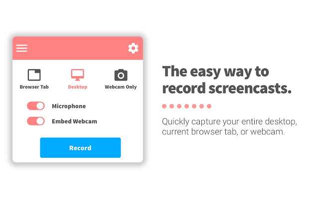
In addition to the above video, they have also included a series of images, such as the following:
The format they have chosen to use for their images is one I try to recommend as much as possible. What makes it an effective image is that it highlights a feature of the extension and shows a corresponding brief (and this is the key here) description about the feature and why it is valuable. Much like the video, the images are done very well.
Overview Section
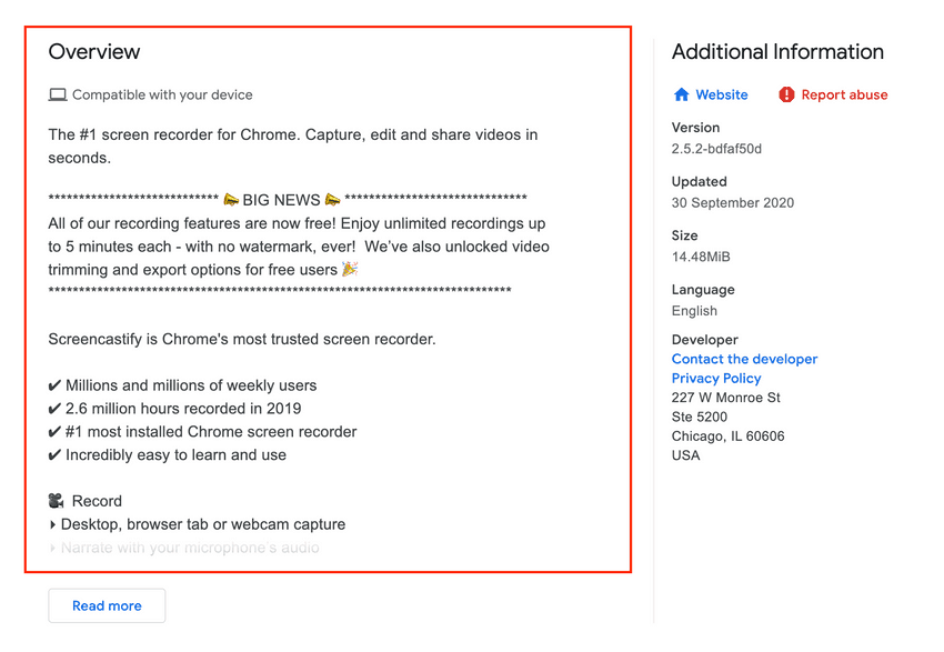
The final section of the extension Web Store page is the overview section, which appears under the carousel and allows for a much longer description of the extension. For this section, I will break down portions of the overview and explain why I think they work well or how they could be improved.
Feature List
One of the first sections of the overview you'll notice is the Features section. Here is a screenshot of one portion of it:
They also repeat the same process for all features (Record, Edit, Share). This is a valuable piece of content in the overview section as it clearly explains all the features that a potential user should expect with each part of the extension. Just by quickly glancing over the features, I am able to figure out that I can record Full HD videos, edit them by trimming or drawing over them, and even have them autosave to Google Drive, among many other features.
Adding a features section like this provides clarity into the features and it also allows you to better explain features instead of being limited due to space (i.e. in the screenshots).
Social Proof
The next overview section is testimonials. Providing social proof is typically beneficial as it provides external validation and customer advocacy. Of course you're going to think your product is great, you built it, however having other people say it's great as well goes a long way. Here is an example of what one looks like on their page:
Generally speaking, it's always beneficial to have social proof, however I think it's equally important to provide confidence that it is a real quote from a real person. I'm not saying this is a made-up quote by any means, however it doesn't take a lot to fabricate a quote and slap a name on the end of it. In this case, a slight adjustment that could have been made is providing a link to the quote source (i.e. if it was a tweet) or potentially including it in a screenshot above.
Clear Use Cases
The last major section defines the use cases for the extension. I really love this idea and think it's a great addition. In fact, I would almost recommend putting it above the social proof section. Here is an example of a use case they provide:
One of the biggest benefits of this section is you may capture some users who didn't even know they could benefit from your extension or you may give them an idea on how to use your extension in a way they hadn't thought of previously.
Conclusion
I hope you found this helpful! The Screencastify Web Store page is done extremely well overall and you could easily use it as a rough template for writing your own extension overview section.
I'll be writing more of these in the future, so if you have any recommendations or want me to review your Web Store page, feel free to tweet me.
I also go more in-depth on the anatomy of a solid Web Store page in the Chrome Extension Kit Ebook, so if you're interested in learning more and picking up some extension starter templates / examples as well, check out the kit.


